UI/UX Recommendations
Best practices for integrating Tapaya Accept SDK into your application to ensure a seamless and trustworthy user experience.
Integrating a payment solution is not just about technical implementation; it's about creating a user experience that feels secure, professional, and easy to use. Below are recommendations for designing your app's flow around the Tapaya Accept SDK.
1. Triggering the Payment
Clear Call to Action (CTA)
Ensure the button to initiate payment is prominent and clearly labeled.
- Good: "Pay €12.50", "Charge Card", "Checkout"
- Bad: "Submit", "Next", "Ok"
Feedback on Interaction
When the user taps the payment button, provide immediate visual feedback (e.g., a spinner or a disabled state) to prevent double-clicks while the SDK initializes.
2. During the Transaction
The Tapaya Accept SDK handles the sensitive parts of the transaction (card reading, PIN entry) with its own UI overlay. However, your app is responsible for the context before and after.
Do Not Obscure the Screen
The SDK requires the full screen to ensure security and prevent overlay attacks. Do not attempt to draw floating windows or chat heads over the payment UI, as this may trigger security mechanisms that abort the transaction.
NFC Positioning Guidance
SoftPOS technology relies on the NFC antenna, which varies by device model.
- Recommendation: If possible, display a quick animation or hint in your app before calling the SDK, showing the user where the NFC chip is located on their specific device (usually the back top or center).
3. Handling Results
Success State
- Visual Confirmation: Display a clear "Success" screen with a green checkmark or similar positive reinforcement.
- Receipts: Offer an immediate option to send a digital receipt (Email/SMS) or print one if a printer is connected.
Failure State
- Clear Error Messages: If a transaction fails, translate technical error codes into user-friendly language.
- Technical:
DECLINED_INSUFFICIENT_FUNDS - User-facing: "Transaction declined. Please check the balance or try a different card."
- Technical:
- Retry Option: Provide a prominent "Try Again" button so the merchant can quickly restart the process without re-entering the amount.
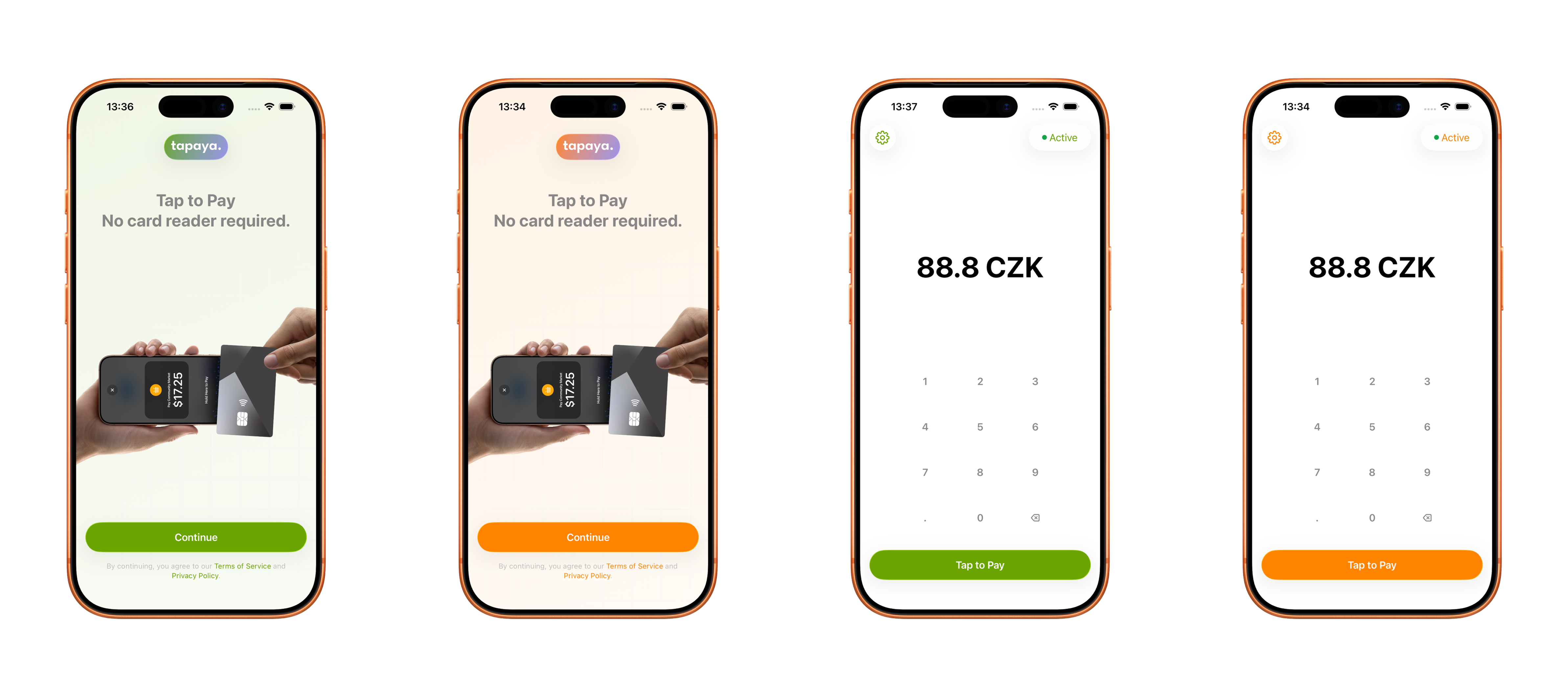
4. SDK Appearance & Branding
Customize the visual appearance of all SDK-presented screens to match your app's brand. The theme is configured once and applies automatically wherever the SDK presents UI.
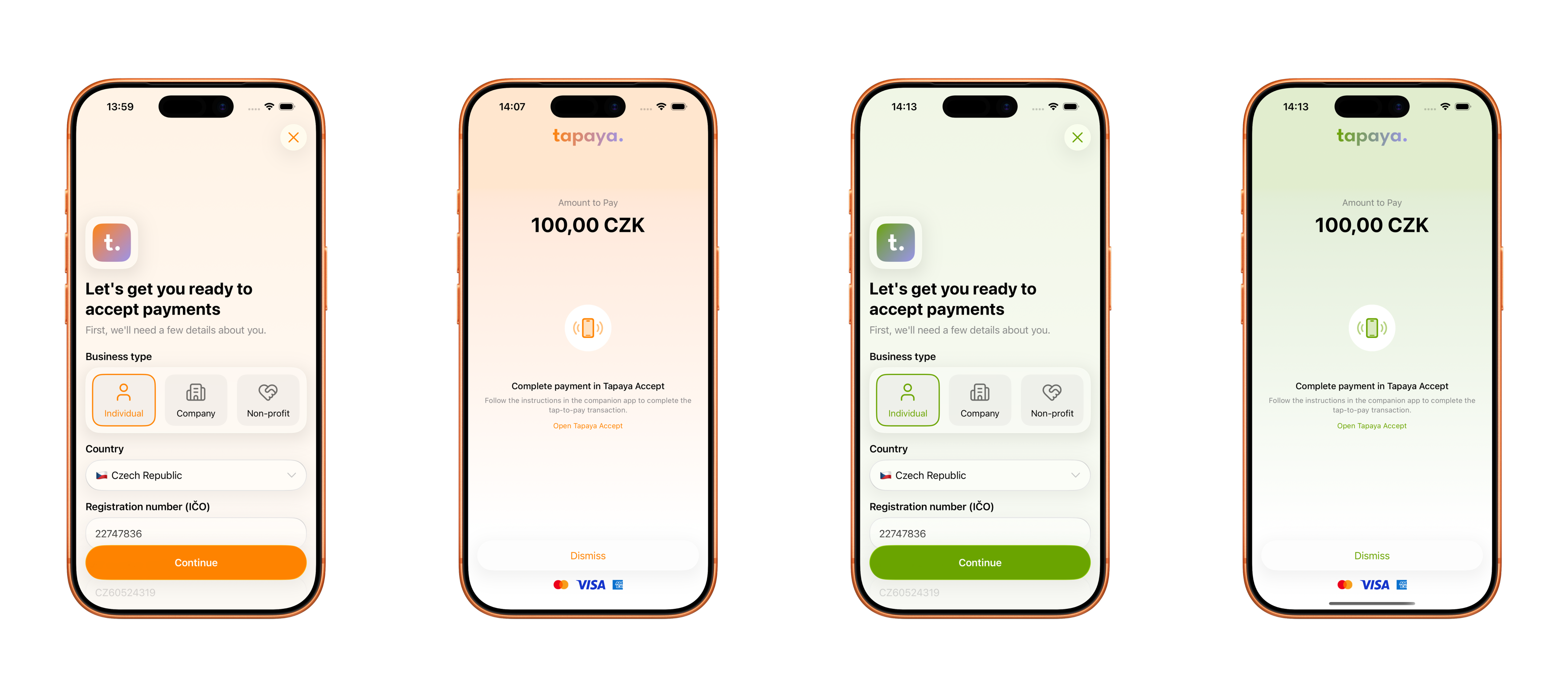
Colors
The accent color cascades automatically to buttons, focus rings, and icon tints — no per-component wiring needed.
| Property | Drives |
|---|---|
| Accent | Button fills, focus rings, icon tints, selection indicators |
| Error | Form validation, error states, failure screens |
| Warning | Warning states |
| Success | Success and confirmation screens |
AcceptSDK.initialize(
    context = context,
    theme = AcceptThemeConfiguration(
        colors = AcceptThemeSource.Local(
            AcceptColorTheme(
                accent = Color(0xFF00A5A2),
                error = Color(0xFFE6282B),
                warning = Color(0xFFFF8000),
                success = Color(0xFF228800),
            )
        )
    )
)
try await Accept.initialize(
theme: AcceptThemeConfiguration(
colors: .local(AcceptColorTheme(
accent: .appAccent,
error: .appError,
warning: .appWarning,
success: .appSuccess
))
)
)import AcceptSDK, { AcceptThemeConfiguration, AcceptColorTheme } from '@tapayadot/accept-react-native';
await AcceptSDK.initialize(false, {
colors: {
accent: '#00A5A2',
error: '#E6282B',
warning: '#FF8000',
success: '#228800',
},
} satisfies AcceptThemeConfiguration);Brand Assets
Replace the default Tapaya assets with your own logo and wordmark.
| Property | Spec |
|---|---|
| Brand Logo | Square, ~40×40 pt. Displayed in a 64×64 pt glass container. Use Original rendering intent to preserve colors. Do not add borders or outlines — they may be clipped. |
| Toolbar Logo | Horizontal wordmark, transparent background, 28 pt height (width scales). Must be legible on both light and dark backgrounds. |
| Solid Logo | Solid (non-gradient) wordmark. Use where a gradient wordmark would clash — e.g. light or colored backgrounds. |

Brand Logo
Toolbar Logo
Solid Logo
AcceptSDK.initialize(
    context = context,
    theme = AcceptThemeConfiguration(
        images = AcceptThemeSource.Local(
            AcceptImageTheme(
                brandLogo = AcceptImageSource.Resource(R.drawable.app_icon),
                toolbarLogo = AcceptImageSource.Resource(R.drawable.app_wordmark),
                solidLogo = AcceptImageSource.Resource(R.drawable.app_wordmark_solid),
            )
        )
    )
)
try await Accept.initialize(
theme: AcceptThemeConfiguration(
images: .local(AcceptImageTheme(
brandLogo: UIImage(named: "AppIcon")!,
toolbarLogo: UIImage(named: "AppWordmark")!,
solidLogo: UIImage(named: "AppWordmarkSolid")!
))
)
)import AcceptSDK, { AcceptThemeConfiguration } from '@tapayadot/accept-react-native';
import { assetToBase64 } from '@tapayadot/accept-react-native';
await AcceptSDK.initialize(false, {
images: {
brandLogo: await assetToBase64(require('./assets/app-icon.png')),
toolbarLogo: await assetToBase64(require('./assets/wordmark.png')),
solidLogo: await assetToBase64(require('./assets/wordmark-solid.png')),
},
} satisfies AcceptThemeConfiguration);Peer dependencies
assetToBase64 requires expo-asset and expo-file-system to be installed in your project.
Updating After Initialization
Call setTheme (iOS) or setThemeConfiguration (Android) at any time to update the theme. Changes take effect on the next flow presentation — a flow already on screen is not affected.
AcceptSDK.setThemeConfiguration(
    AcceptThemeConfiguration(
        colors = AcceptThemeSource.Local(
            AcceptColorTheme(accent = Color(0xFF00A5A2))
        ),
        images = AcceptThemeSource.Local(
            AcceptImageTheme(
                brandLogo = AcceptImageSource.Resource(R.drawable.app_icon),
                toolbarLogo = AcceptImageSource.Resource(R.drawable.app_wordmark),
                solidLogo = AcceptImageSource.Resource(R.drawable.app_wordmark_solid),
            )
        )
    )
)
await Accept.setTheme(AcceptThemeConfiguration(
colors: .local(AcceptColorTheme(accent: .appAccent)),
images: .local(AcceptImageTheme(
brandLogo: UIImage(named: "AppIcon")!,
toolbarLogo: UIImage(named: "AppWordmark")!,
solidLogo: UIImage(named: "AppWordmarkSolid")!
))
))import AcceptSDK from '@tapayadot/accept-react-native';
import { assetToBase64 } from '@tapayadot/accept-react-native';
await AcceptSDK.setTheme({
colors: {
accent: '#00A5A2',
},
images: {
brandLogo: await assetToBase64(require('./assets/app-icon.png')),
toolbarLogo: await assetToBase64(require('./assets/wordmark.png')),
solidLogo: await assetToBase64(require('./assets/wordmark-solid.png')),
},
});Platform-level configuration coming soon
A future release will let you manage branding directly in the Tapaya platform — no code changes required.
5. Companion App (iOS)
The Tapaya Companion app is an iOS-only app that lets merchants accept card payments independently. Integrators can customize the merchant experience in the Companion app — contact developers@tapaya.com to get started.
UI Customization
The Companion app supports the same AcceptTheme API used in the SDK. Colors and brand assets (logo, wordmarks) configured via AcceptThemeConfiguration apply consistently across both your host app and the Companion app.
Custom App Store Listing
Integrators can distribute a white-labeled version of the Companion app under their own App Store listing — with a custom name, icon, and screenshots. This lets merchants download the app directly from your brand's App Store presence.
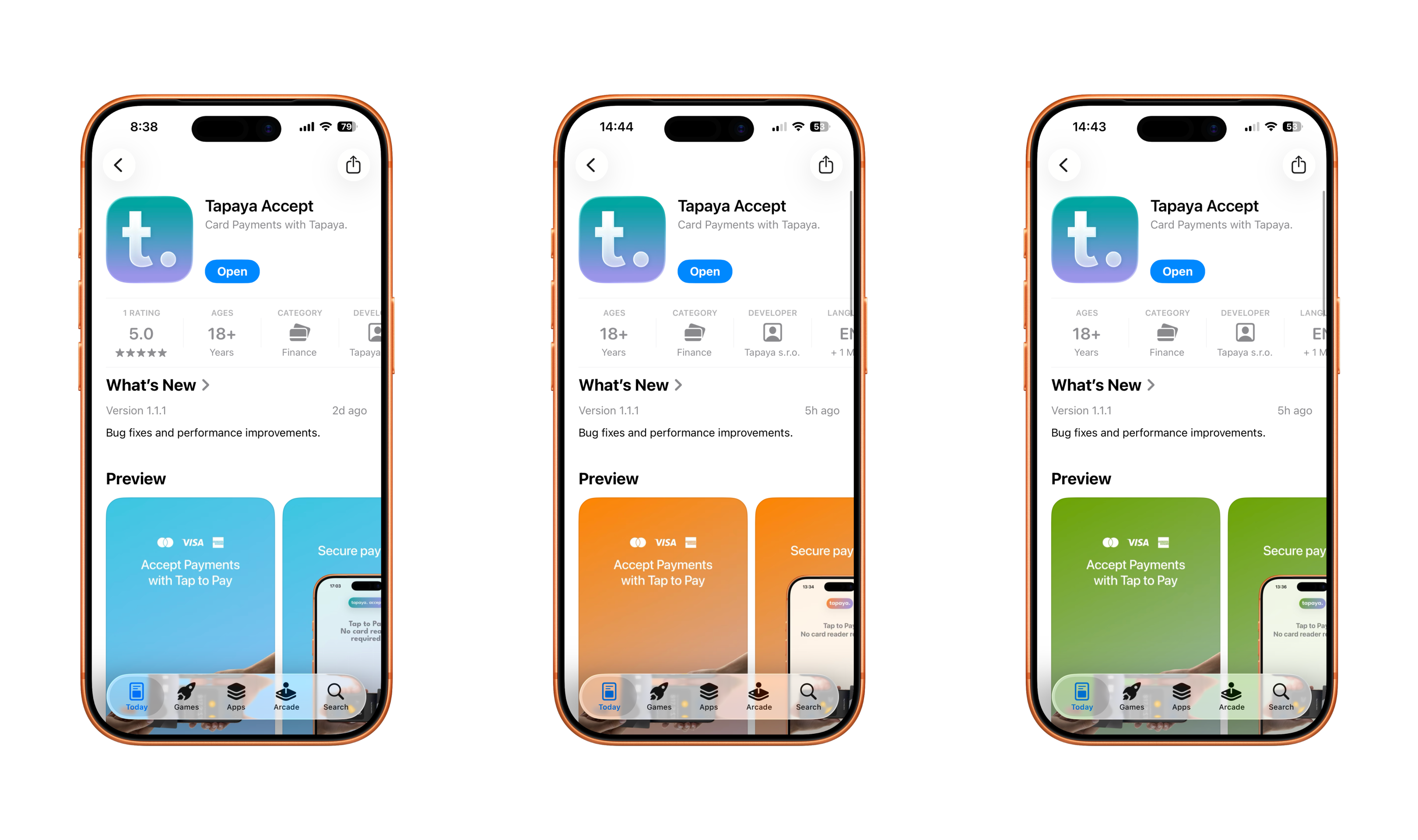
To request a custom listing, contact developers@tapaya.com.
6. Accessibility
- Sound: The SDK emits audio cues for card reads and errors. Ensure your app does not mute system volume or interfere with audio focus during a payment.
- Haptics: The SDK uses vibration to confirm card reads. This is crucial for accessibility and general feedback in noisy environments.